Purpose
The purpose of this project was to create an original app that utilizes dark UX/UI principles and design psychology for good. Branding and a working prototype was to be developed for the app. For this project, I decided to create an app that gives users suggestions on what to wear based on the weather. This was chosen as I personally have trouble translating the temperature into what should be worn, and this app would be something that I would be grateful to have.
Programs
Adobe Illustrator
Adobe Photoshop
Figma
Goals
To conduct research, select a target audience, generate branding, create low and high fidelity wireframes, and create a working prototype for an original weather app
Research
I began by conducting research on weather apps that already exist. I started with this as I could list off a few weather apps off the top of my head, therefore, I wanted to see how large the market was, and what each of the popular apps included. I found that there are quite a few existing weather apps and the most popular ones had similar features such as hourly and daily forecasts, humidity, and wind speed amongst others. Furthermore, I found that there are already existing apps that give clothing suggestions based on the weather. Once again, I looked at their common features. These findings influenced what I thought would be important to include in my design, and what I could include to set my app apart from the competitors.
I next conducted research on dark UX / UI patterns and design psychology. I looked at misleading messaging, visitor traps, hidden costs or information, confirmshaming, disguised ads, the Von Restorff effect, Hick’s law, and Fitts law. This was done in order to get a better understanding of what to avoid, and what I could spin into something positive. Although no final decisions were made at this point, getting a better understanding of these tactics was a big help when planning the app.
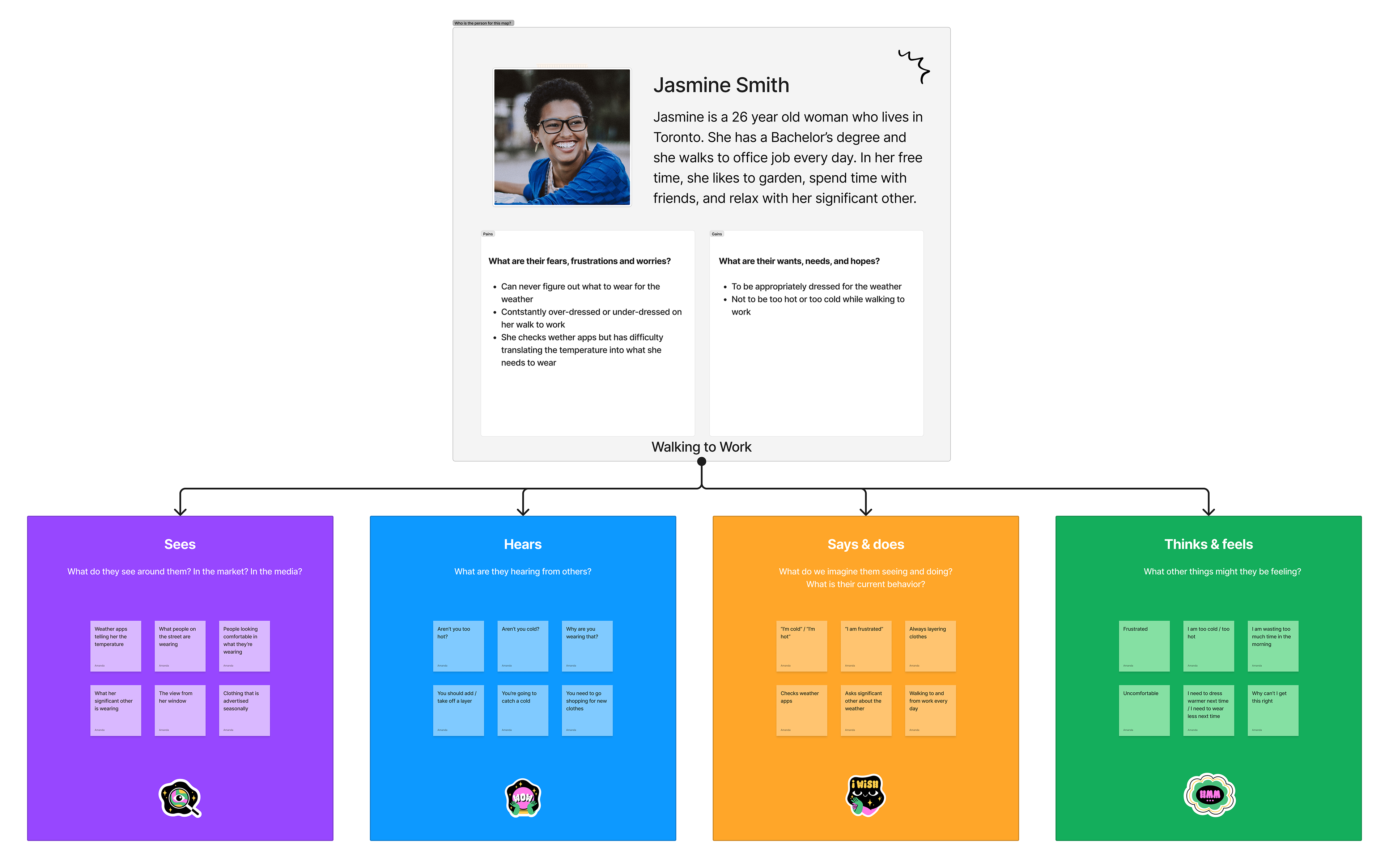
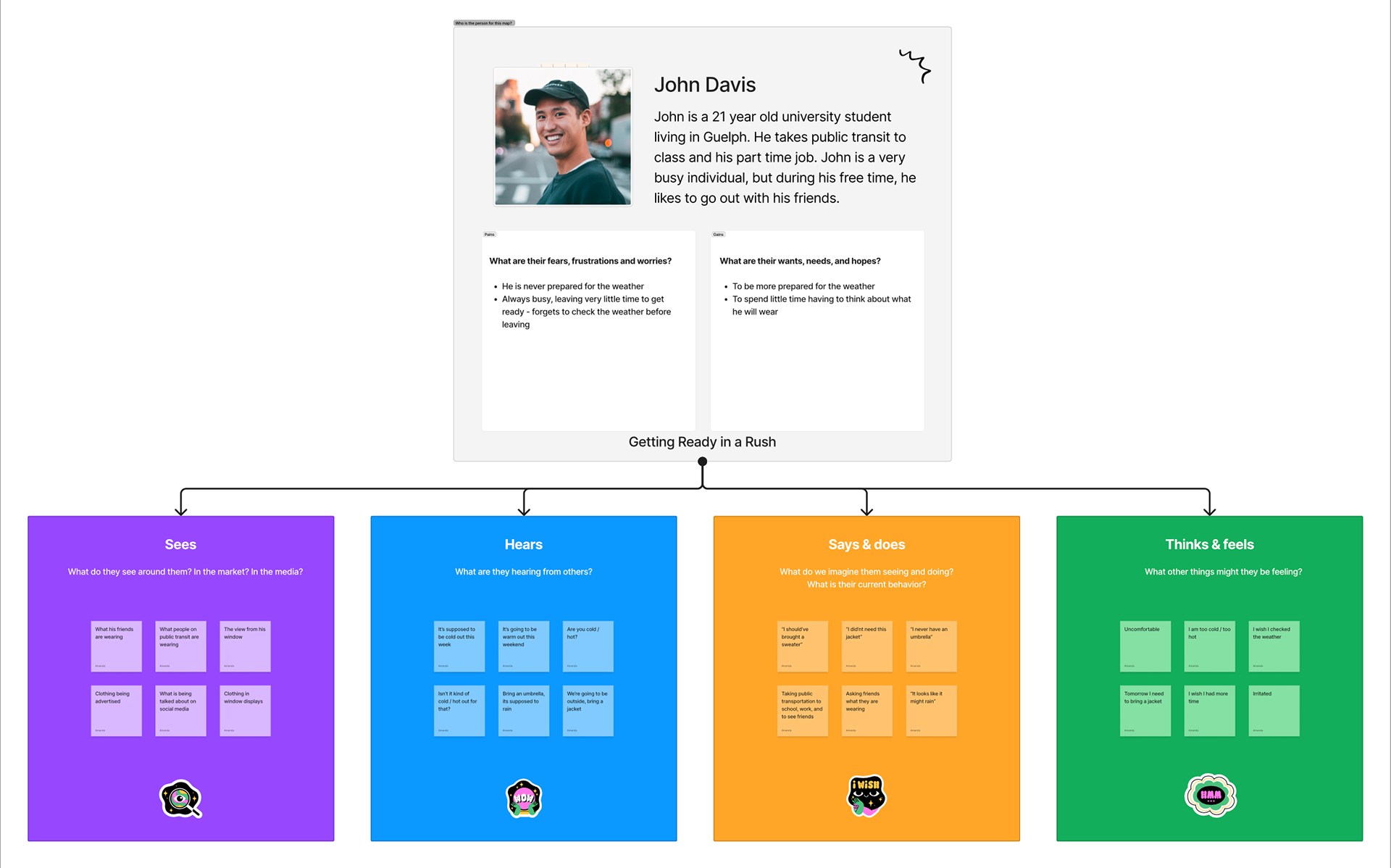
After completing research by reading online, I moved on to audience personas and empathy maps. I chose to complete these to better understand who I’m targeting the app towards and what would lead them to wanting to download the app. Through these tactics, I concluded that the app would be targeted towards individuals who are aged 20 to 30 who like to keep an eye on the weather. When seasons change, at times they may be unsure of what to wear for the weather, and will usually over-dress or under-dress for the conditions. This target audience information was helpful when deciding on the branding for the app.
Design Iteration and Process
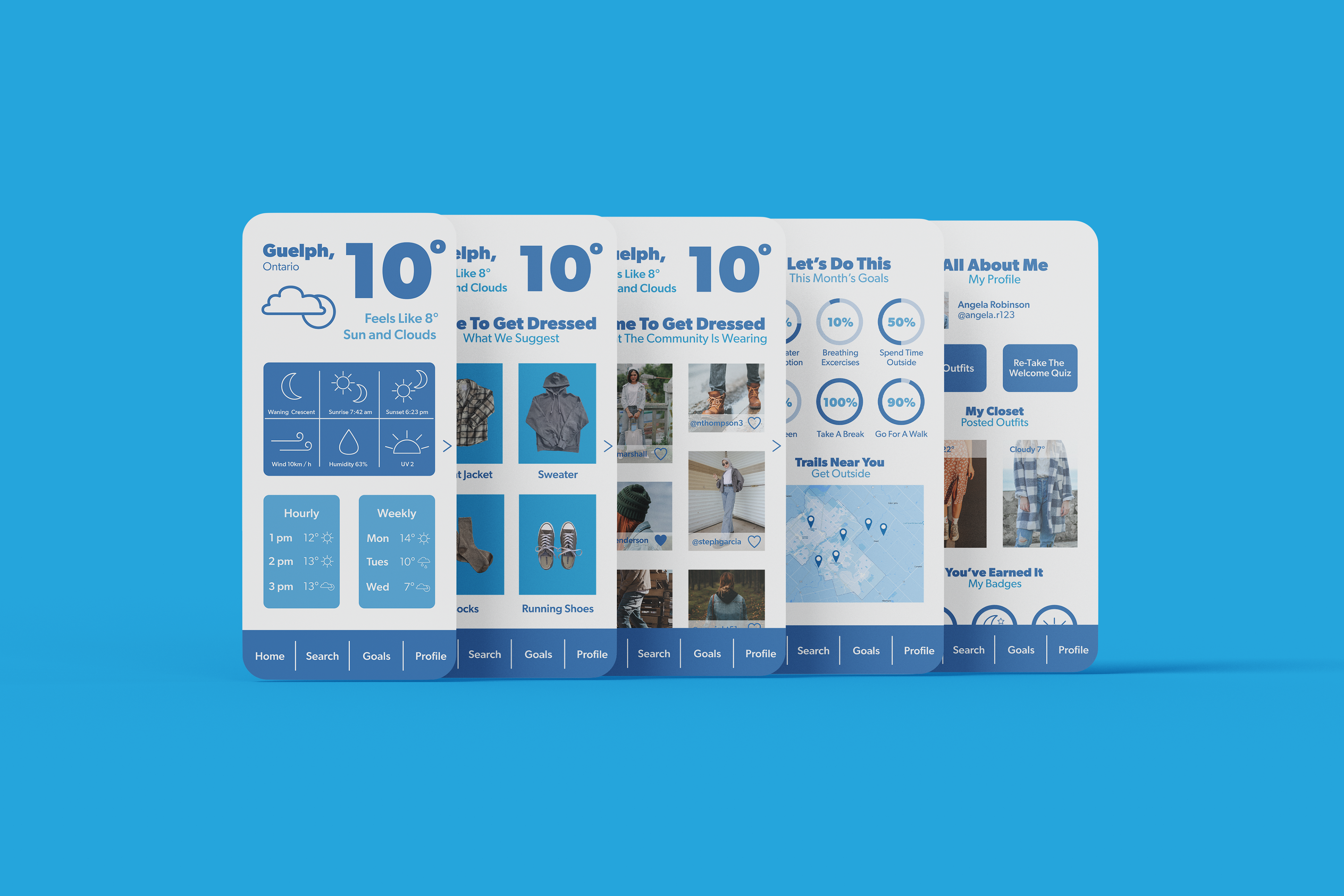
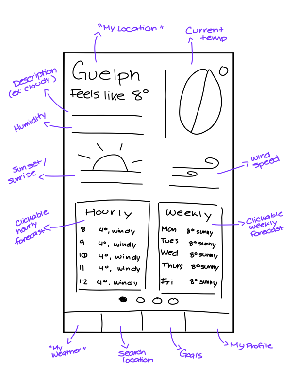
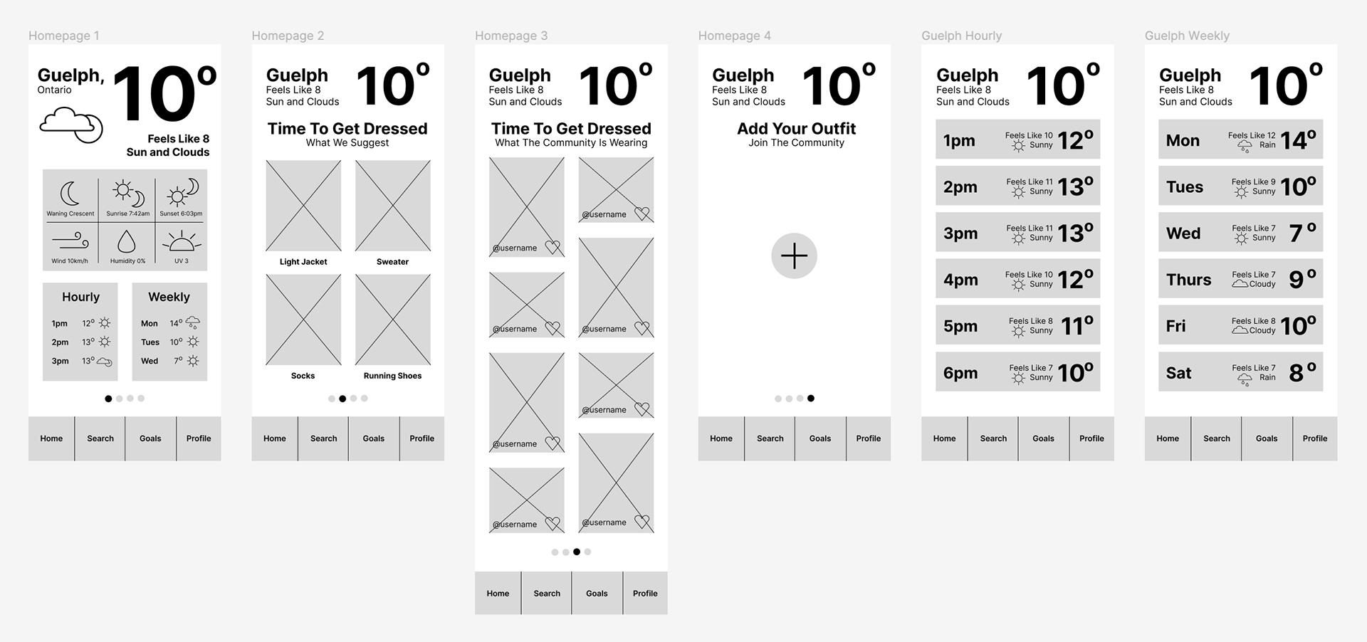
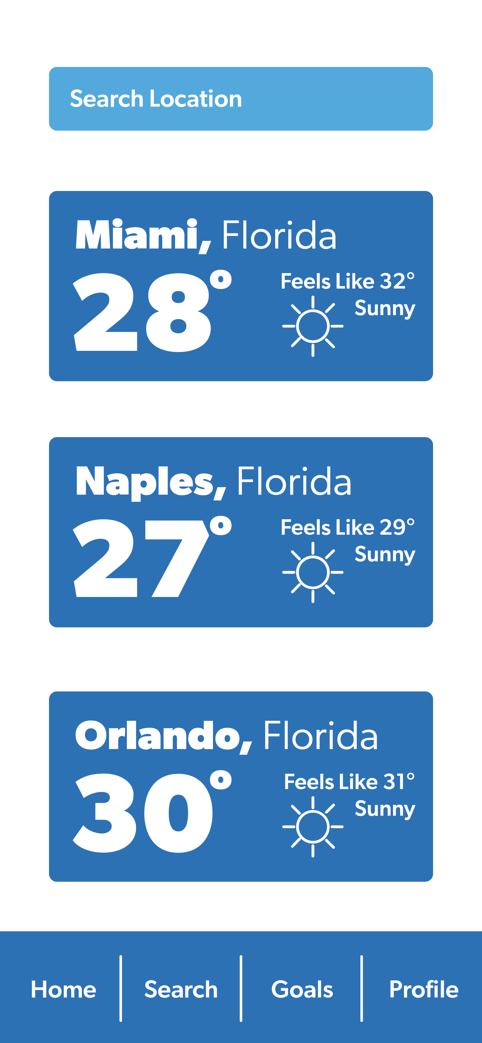
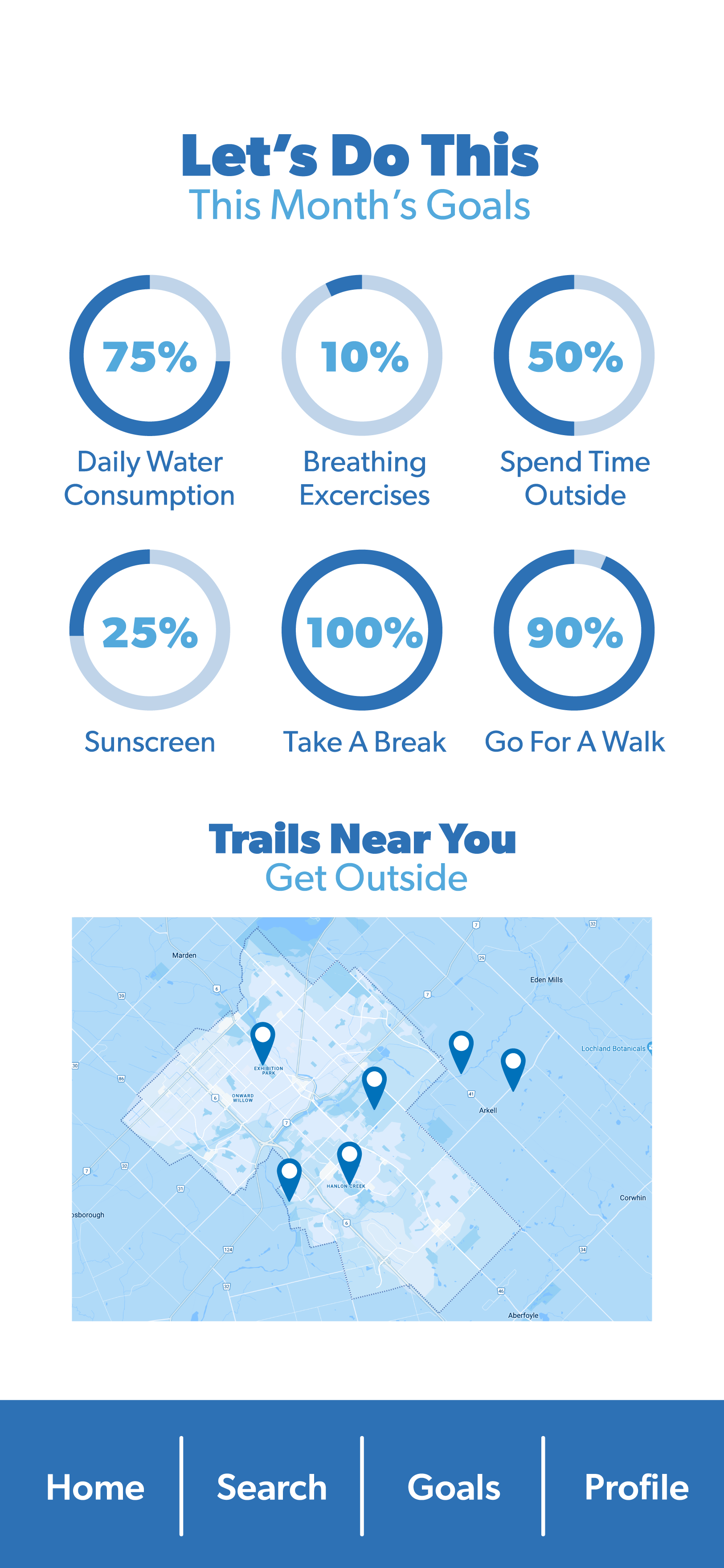
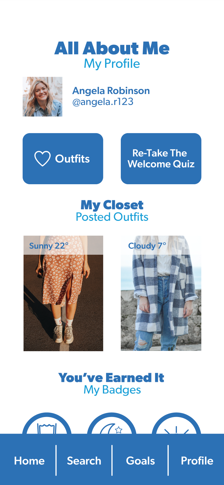
I began the iterative design process by creating a site map. This was done in order to finalize what I would be including in the app as well as where I wanted these features to be located. I decided on including four main categories for the app: the user’s chosen location, location search, monthly goals, and profile. The goals section was added specifically to set the app apart from other existing apps. Adding this gamefied element would perhaps add another layer of intrigue, while persuading the user to complete healthy tasks. Establishing what was to be included in the app and where it would be located was greatly helpful for my next step, low-fidelity wireframes.
Next, I moved on to low-fidelity and high-fidelity wireframes. The low-fidelity wireframes were completed in order to get a rough idea of how the app will look. These initial sketches were the basis of my high-fidelity wireframes. The high-fidelity wireframes were created in Figma, and they served as a more refined version of the app. These high-fidelity wireframes were later turned into a rough prototype in which user testing could be conducted.
Results and Next Steps
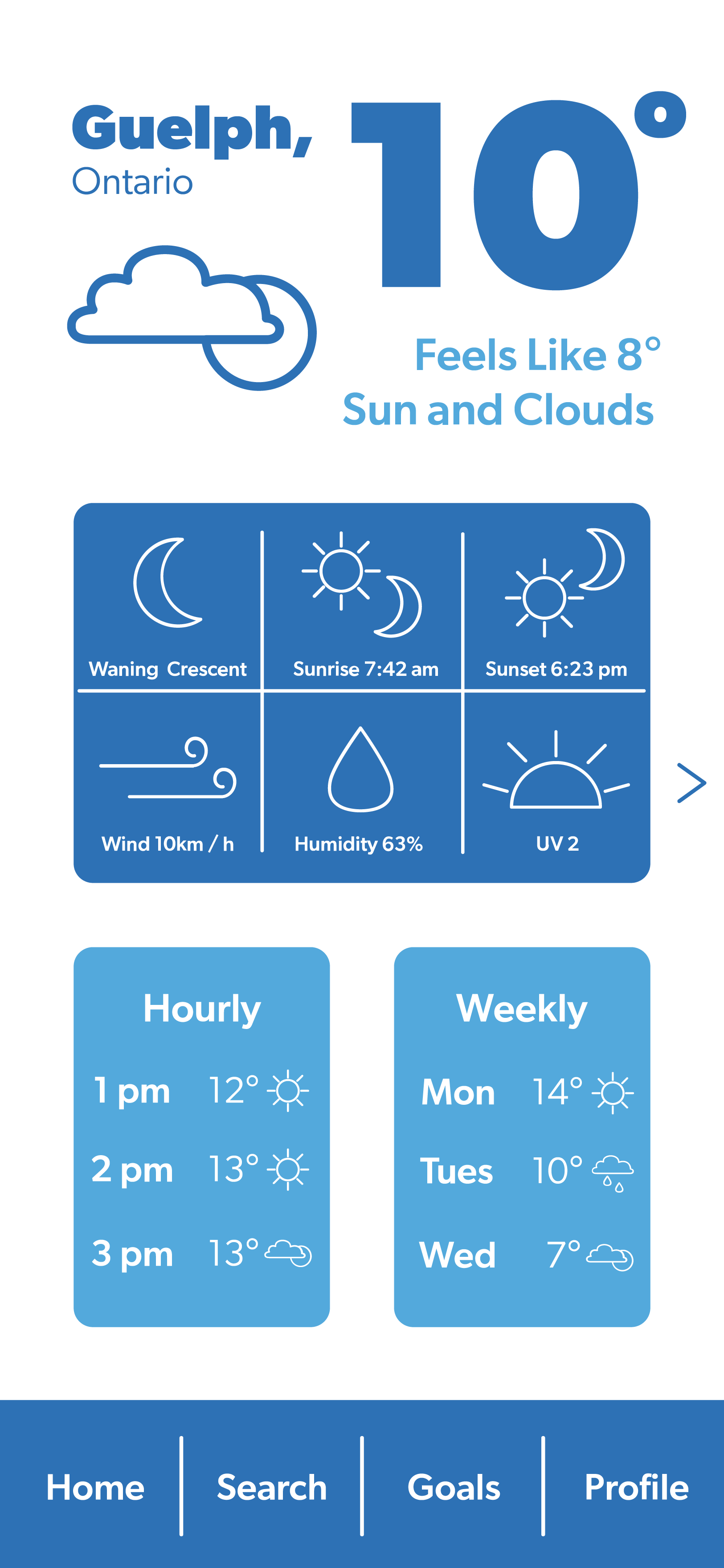
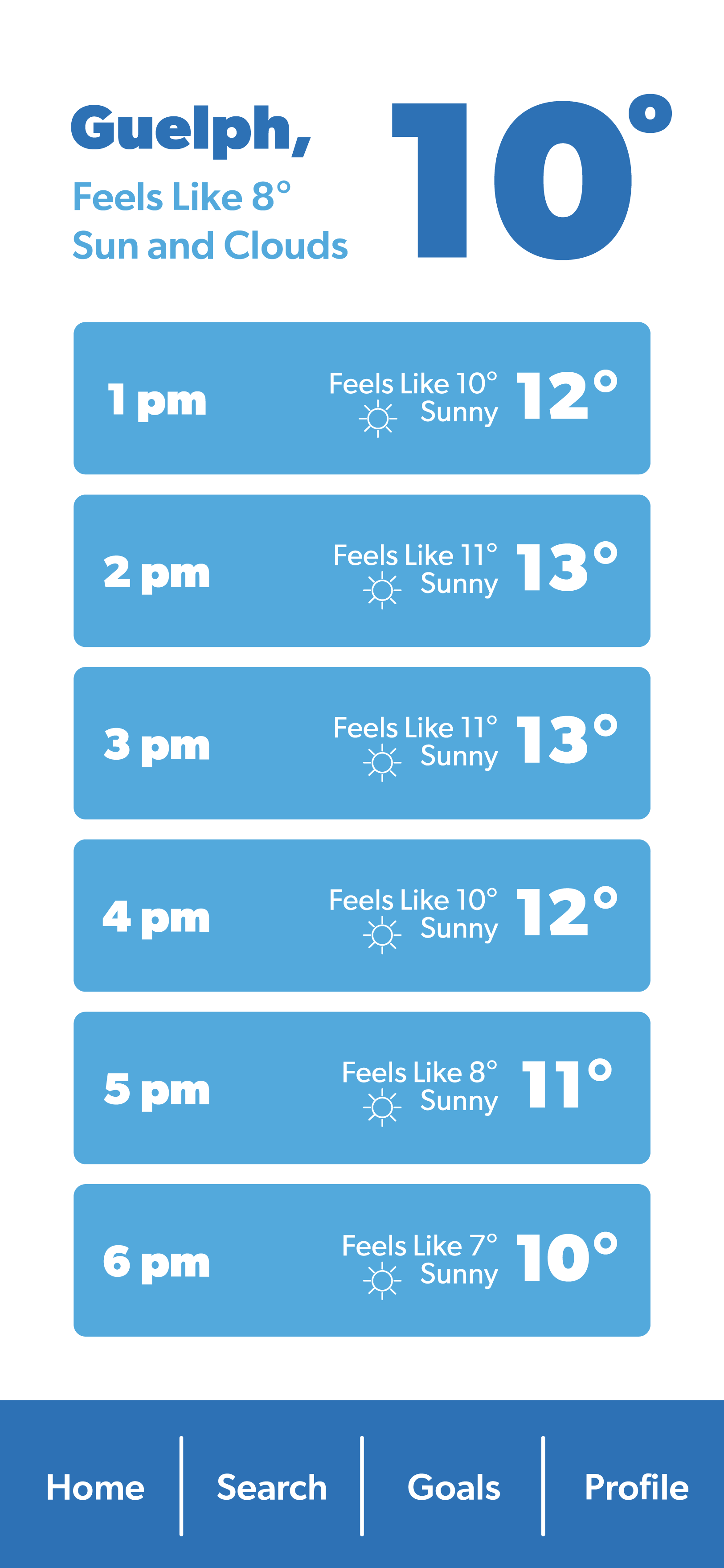
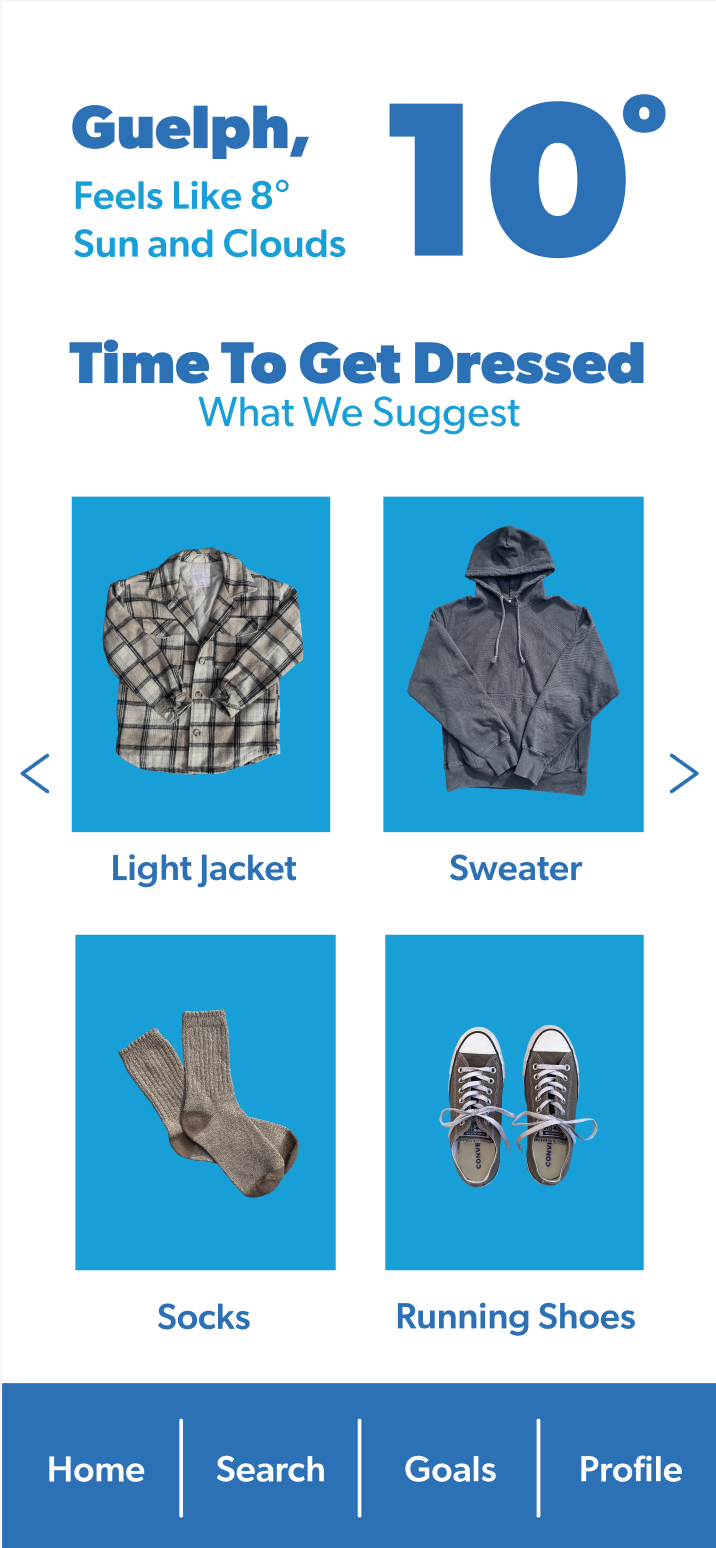
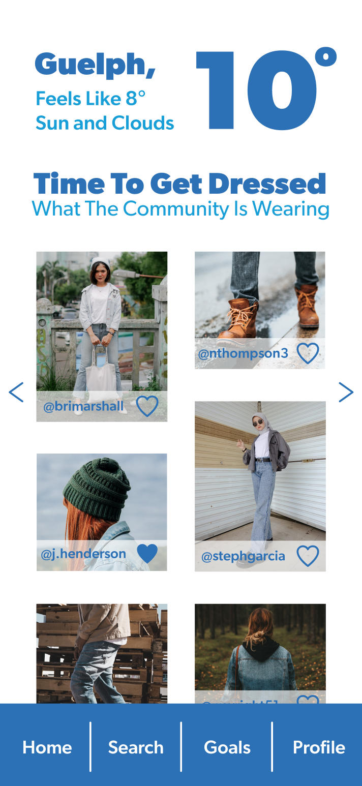
The app opens with a welcome quiz to establish information such as the user’s current location, if their body temperature typically runs warmer or cooler, and what type of temperature they prefer. The user can eventually check the weather and gain suggestions on what to wear. Additionally, they could look at what the Nimbus community is wearing, as well as add their own images. In order to set the app apart from its competition, Nimbus also provides the user with monthly goals to promote healthy living, as well as a handful of walking trails nearby.
The final iterations of Nimbus Weather + uses consistent branding and imagery to unify its image. It uses the font family “Gibson” throughout, and limits its colour palette to dark blue, light blue, and white. These colours were selected as they reflect knowledge, loyalty, water, and the colour of the sky. Its logo highlights the word “us” in order to emphasize the social aspect, while also highlighting the dot in the letter “i” to emphasize the individual user.
In regards to using dark UX / UI principles and design psychology tactics for good, the app uses certain tactics while avoiding others in order to be conscientious of the user. Firstly, the app would use push notifications to alert the user of the current weather as well as encourage them to participate in the monthly goals. Although these notifications would encourage the user to look at the app when they perhaps would not have otherwise thought to, they would be promoting helpful information or healthy goals. Furthermore, the Von Restorff effect is used when isolating, and in effect isolating the word “us” in the logo. As previously mentioned, this was done in order to emphasize the social element of the app. Additionally, Hick’s law was used in the way that only four clothing items are suggested to the user. Perhaps if more were recommended, they would still be unable to decide on what to wear.
Conclusion
I believe that the app is successful in its main goal of providing the user with suggestions on what to wear based on the forecast. Furthermore, the app uses consistent branding while applying dark UX / UI principles and design psychology tactics in a positive manner. In the future, I would like to perhaps expand the social media factor into something larger, and maybe even add some monthly goals that would encourage the use of this social factor. However, I do believe that it is a viable product. I think that Nimbus Weather + could be a helpful tool to individuals who struggle with dressing for the weather.